New look, new paint, yet same tradition and historic appeal for Flaming Arrows
Uniform aesthetics have become a desirable form of sports content that flairs debate, flashes subtleties of fashion and art and allows for a deeply rooted recruiting tool tying together history, culture and progressive thought.
In pro and college sports, we have seen jockeying amongst the largest uniform, helmet, hat and footwear manufacturers in recent years to generate year-over-year interest and revenues.
At the high school level it is entirely about recruiting and keeping a generation of student-athletes so overloaded with imagery and graphics on digital platforms enthused about the threads they wear in the physical world. It is not just the meaning of the name on the front and back of the uniform, but the detail in colors, stitching, placement of stickers, and offsetting combinations between home and road contests.
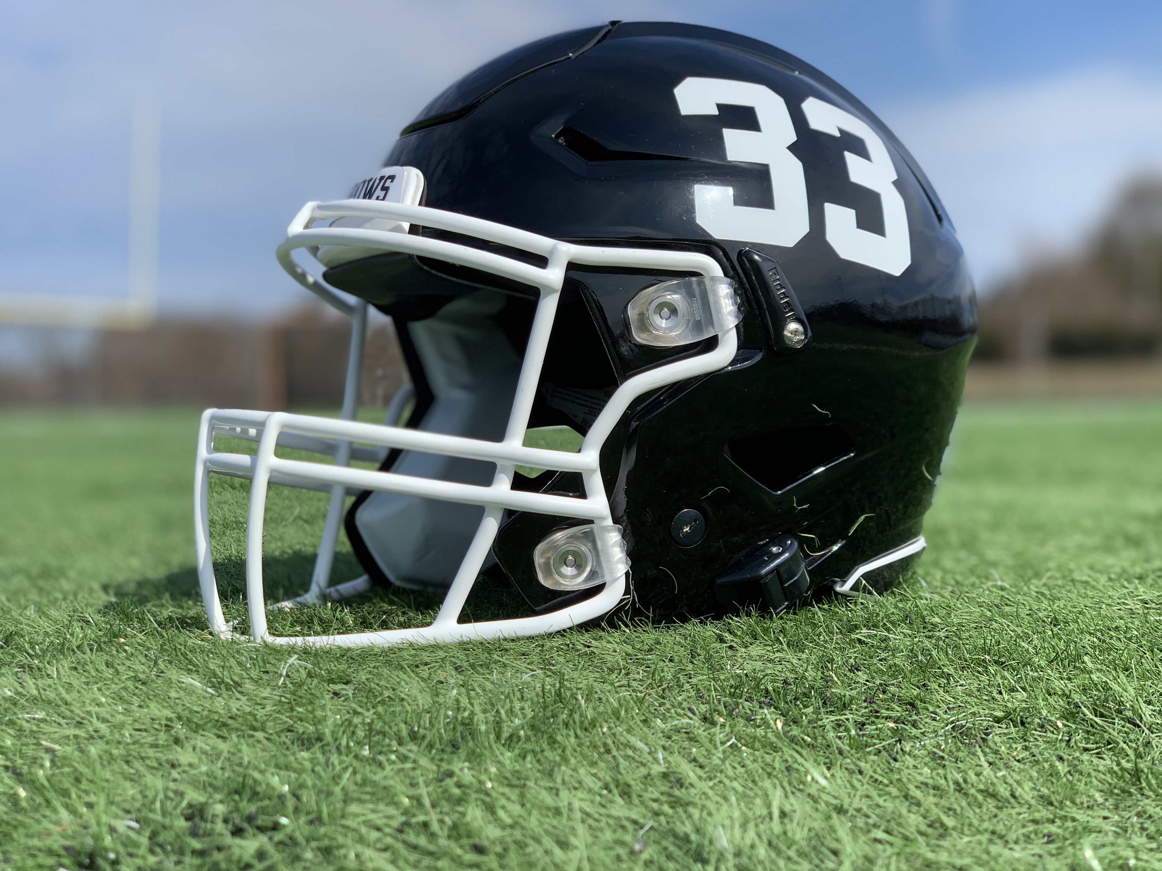
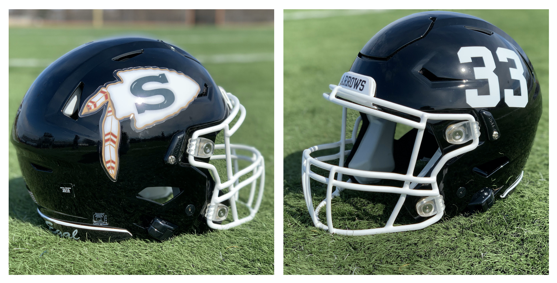
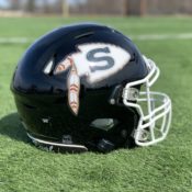
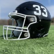
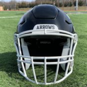
After nearly 50 years of the same helmet – black with the famed arrowhead logo – Sachem North football will make some subtle changes to their lids. This is the first major helmet change since 1972.
This fall the helmets will feature one side with the arrowhead logo and one side with numbers. These numbers are appropriately called “Alabama numbers” since the Crimson have been known to sport this style for decades.
The 2020 helmets will also return to a glossy black paint, which was abandoned in 2011, and feature a new strip on the base of the back which says, “Sans Egal,” a Latin phrase meaning “Without Equal” that was adopted by Sachem’s founders in the 1960s. It has stood the test of time with Sachem diehards.
“We are always looking to create excitement surrounding our program,” said Sachem football coach and alum Dave Caputo. “Although we always respect our tradition, change is exciting and fun. We will never be a program that says, ‘well, this is how it’s always been done.’ Our decisions are always centered around recruiting, and we know that kids love uniforms and helmet designs.”
The addition of “Sans Egal” on the helmet was the brainchild of Sachem associate head coach and offensive coordinator Greg Lauri. Caputo and defensive coordinator Dave Pittman, who both played at Cornell University, loved the idea because it presents an Ivy League undertone.
“In the Ivy, many teams showcase their crest and motto on their helmets and uniforms,” he said. “To me, this celebrates the importance of being a student-athlete in Sachem.”
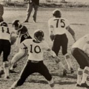
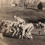
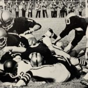
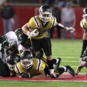
Sachem’s football program debuted in 1959 as a JV team, using two seasons to build up personnel, strategy and recruiting efforts. During year one of the program they used black helmets with a gold stripe down the middle, but by 1960 it was all about the gold. Think Notre Dame.
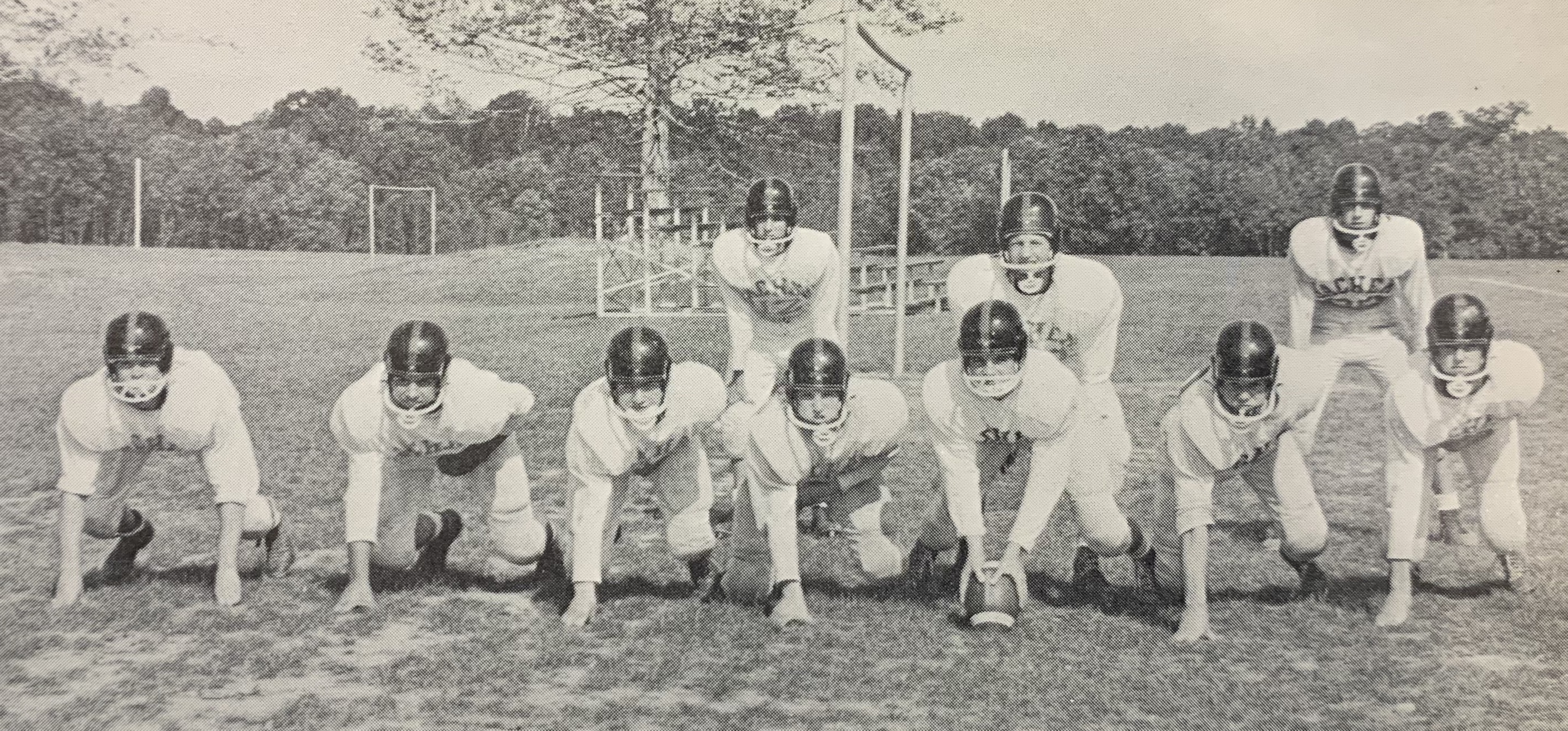
From 1960 through 1971 there were variations of gold; gold with stripes, gold with an “S”, just gold. It was classy and matched one of the school district’s predominant colors.
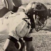
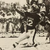
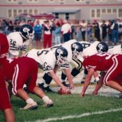
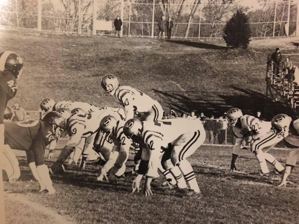
When Fred Fusaro arrived in 1971, a young and hungry head coach with experience from the college ranks, it took him one season to make a major adjustment and go to a black gloss look with an arrowhead for the first time. It has been the main look for almost 50 years, give or take some minor tweaks.
Fusaro was inspired by the Kansas City Chiefs and Florida State University when choosing a logo to match the Flaming Arrows moniker. He obviously went with the Chiefs look.
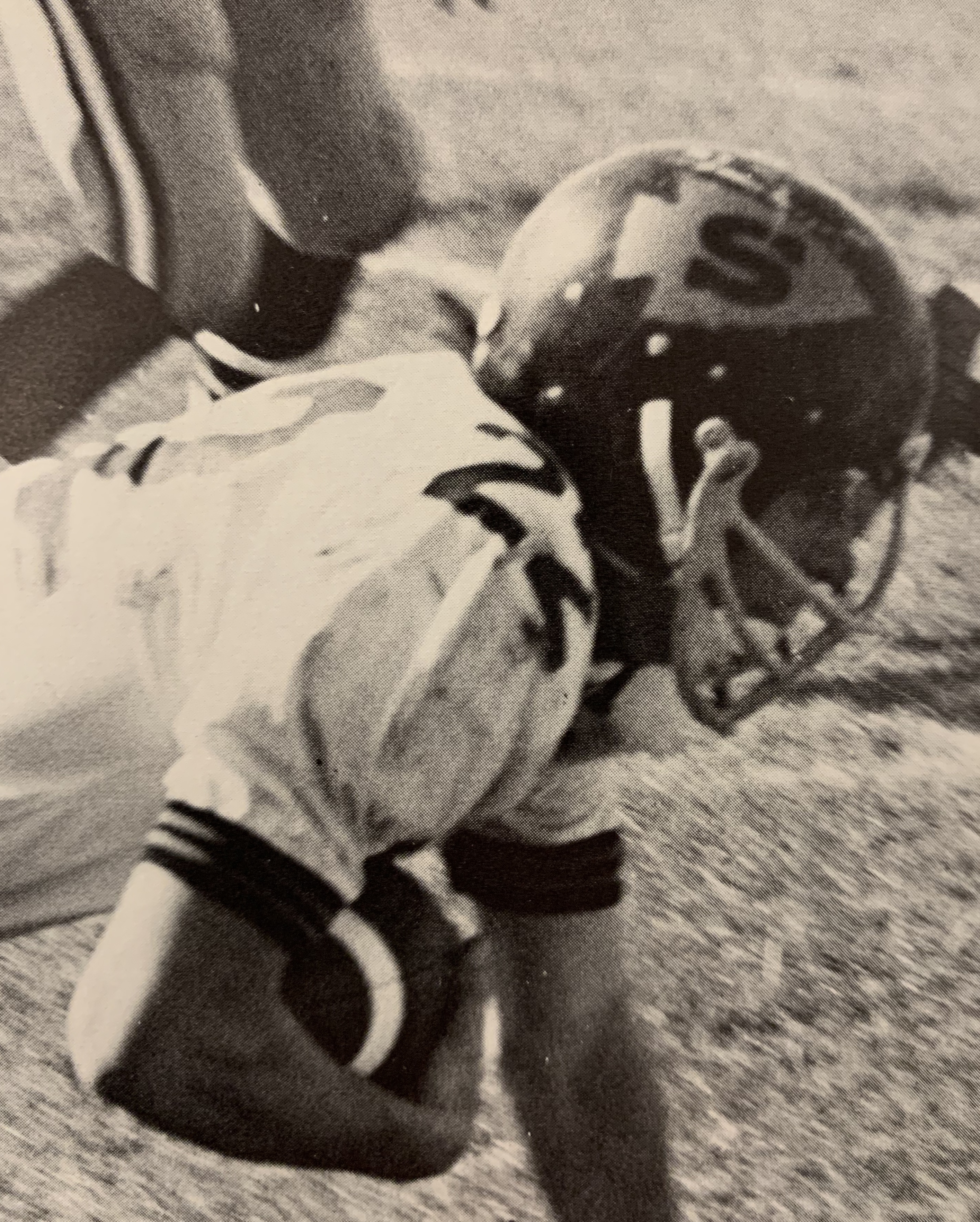
At first there was an arrow in old gold coloring, but one year later it appeared white and has been the same since. All teams across the district eventually adopted the same logo. When Sachem East was built in 2005, the football program adopted the Florida State look.
In 1980 there was another subtle addition to the helmet … feathers! The additional detail added feathers right next to the arrow to make it a more full and wholesome logo. The only problem was that Sachem won three straight Suffolk County championships from 1977 through 1979 and then didn’t once the feathers were added. After two seasons it was back to the basic arrowhead.
“I wanted to add the feathers for a while, but we were on a good run and that finally changed once we added the feathers,” said Fusaro.
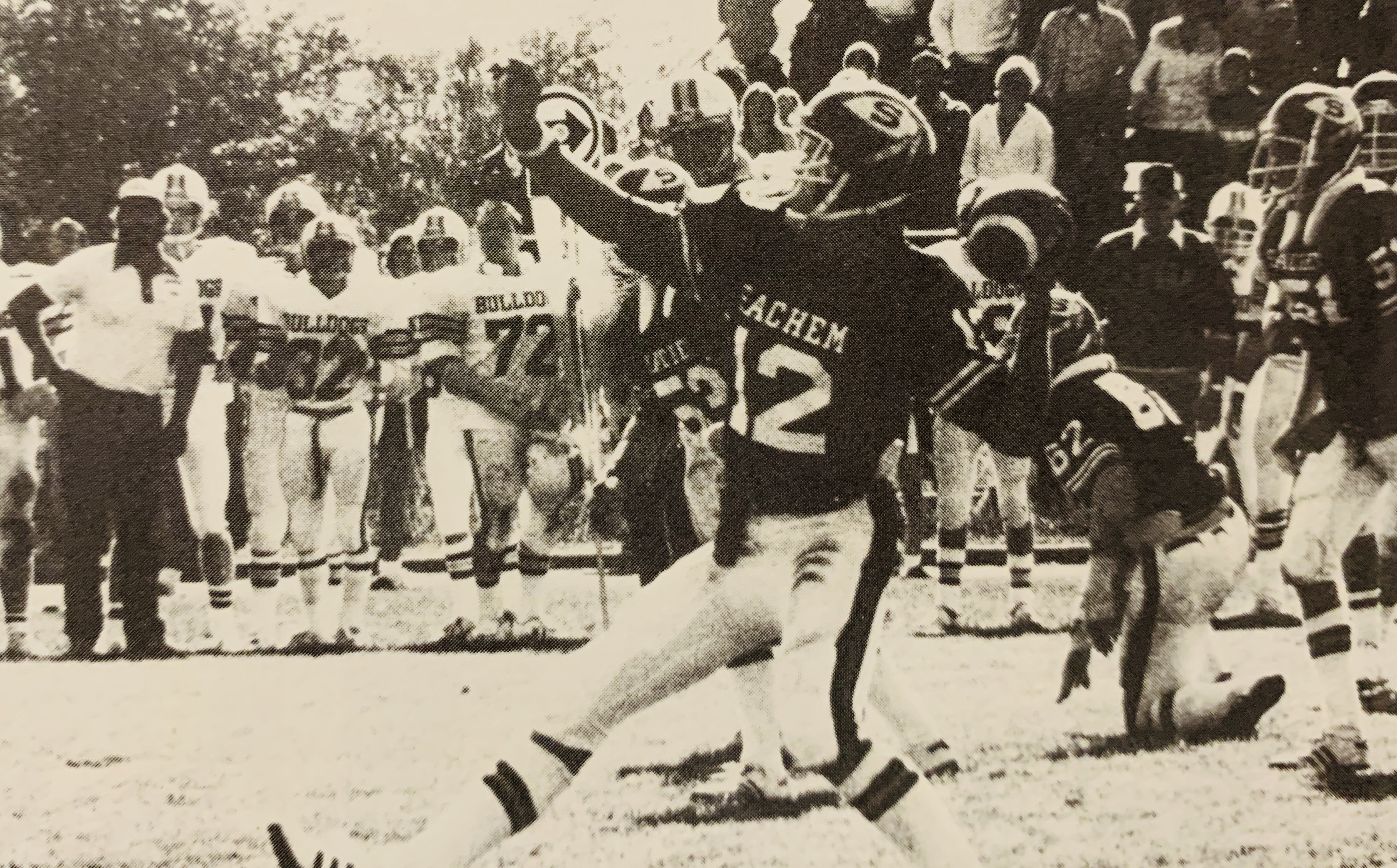
From 1982 through 2000 there were no changes. At the turn of the century feathers were added once again thanks to some pushing from Fusaro’s assistants and that logo has been in place for 20 years.
In 2011 the glossy helmet finish took a backseat to the increasingly popular matte finish. This style was in place until this season. A new era is here with gloss, helmet numbers and an ode to the old school with the text on the back.
Still, even with slight adjustments, it’s the logo that carries the tradition and holds the consistency. Fusaro and Caputo agree the logo is here to stay.
“The arrowhead logo has always been on the helmet and it always will be,” said Caputo. “It is iconic and stands for so much in our community.”
“Our logo is very distinct,” added Fusaro. “I would never entertain the thought of changing it.”
The JV helmet will also undergo a unique change this year. While varsity will pay homage to Alabama, the JV helmet will mimic Ohio State. There will be a stripe down the center and players will be able to add mini arrowhead pride stickers after each game, similar to how Ohio State adds mini buckeyes. That makes two trendy college teams that kids admire as the anchor for recruiting efforts.
Said Caputo, “We try to strike a balance at Sachem; maintain our traditions, yet still embrace modern changes.”
SACHEM FOOTBALL HELMET TIMELINE
- 1959 – JV only – Black with stripe in middle
- 1960 – JV only – Gold
- 1961-1965 – Gold
- 1969 – Gold with black stripe
- 1970-1971 – Gold with black “S”
- 1972 – Black with “old gold” arrowhead, no feathers
- 1973-1979 – Black (gloss) with white arrowhead, no feathers
- 1980-1981 – Black (gloss) with white arrowhead, feathers
- 1982-2000 – Black (gloss) with white arrowhead, no feathers
- 2000-2010 – Black (gloss) with white arrowhead, feathers
- 2011-2019 – Black (matte) with white arrowhead, feathers
- 2020 – Black (gloss) with white arrowhead and feathers on one side, Alabama numbers on other and “Sans Egal” on back
-Words by Chris R. Vaccaro
